
excel 長條圖 histogram
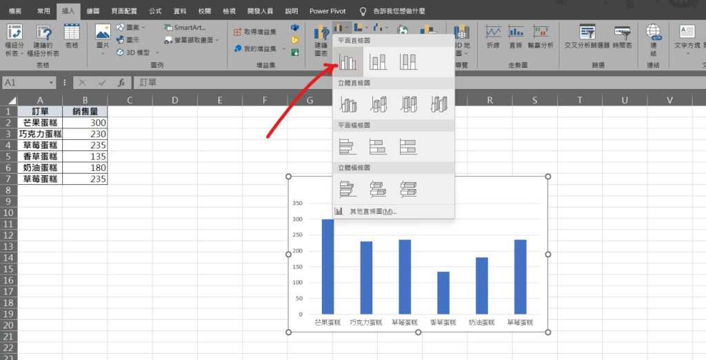
Step 1 將資料範圍選取後,在功能列「插入」中圖表選擇「插入直條圖」,並選擇平面直條圖
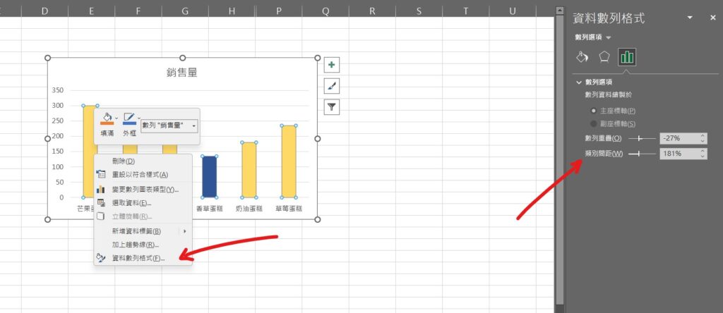
Step 2 點選圖表中的長條狀圖,點擊滑鼠「右鍵」選擇「資料數列格式」,在右方「資料數列格式」視窗可以調整數列顯示設定
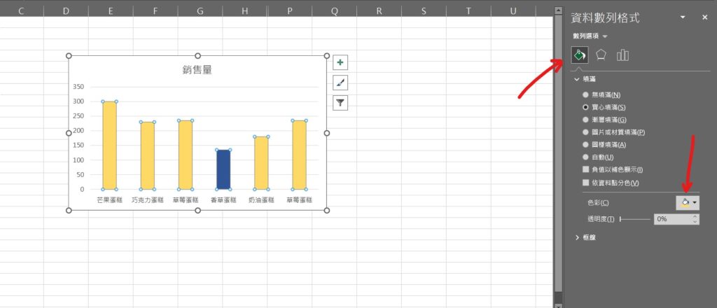
Step 3 點選「填滿」,在實心填滿選項「色彩」可以更改柱狀條的色彩填滿
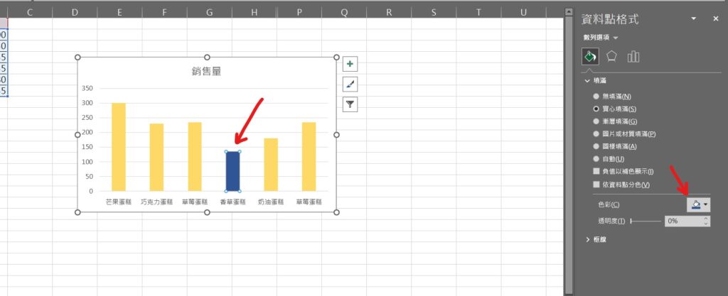
Step 4 點選單一柱狀條,可以對其進行編輯,在填滿中選擇「色彩」,可單獨修改顏色
【教學】Excel 如何將資料以長條圖(histogram)表示?超簡單必學不能不會!
2 thoughts on “【教學】Excel 如何將資料以長條圖(histogram)表示?超簡單必學不能不會!”